Introduction
What is it?
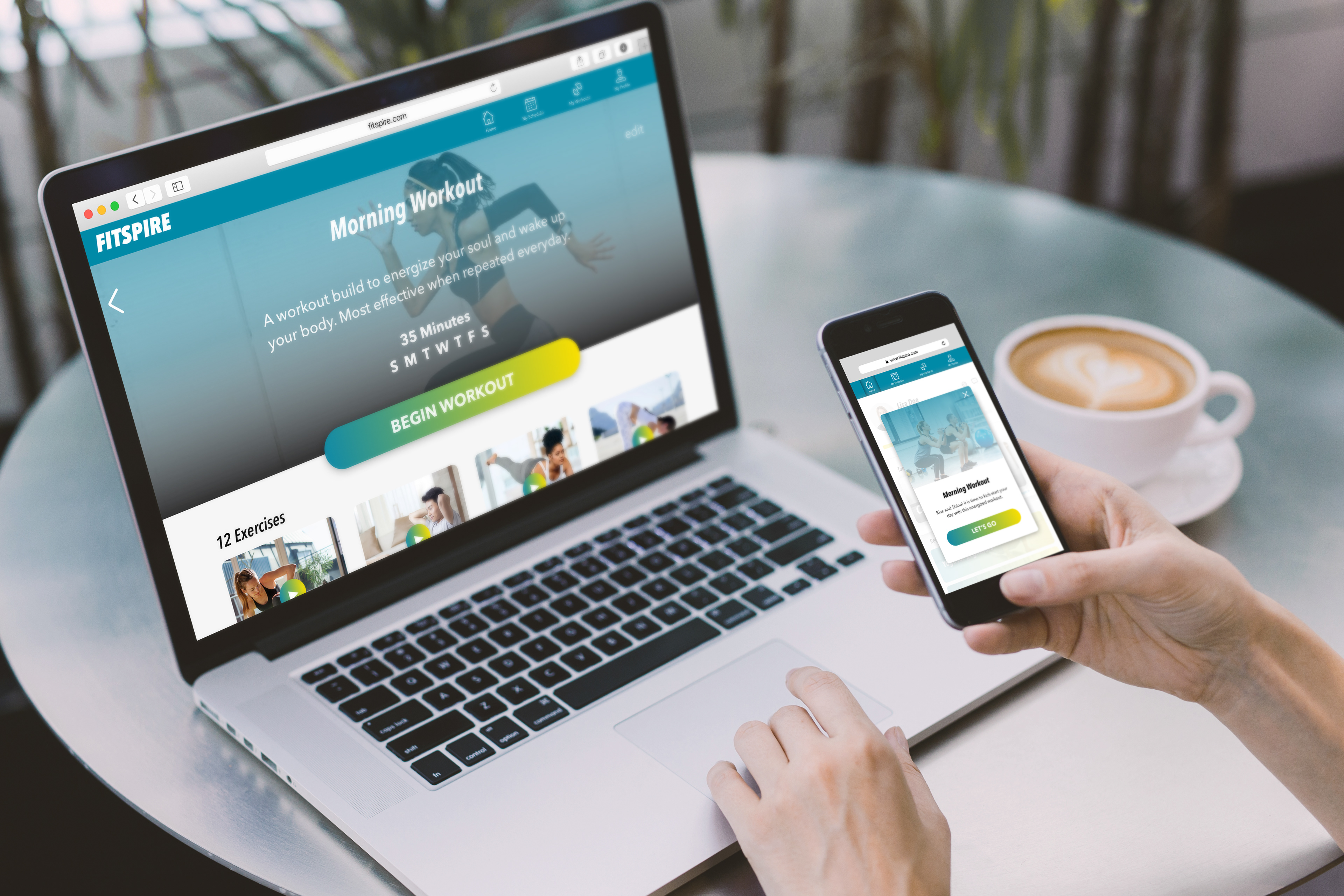
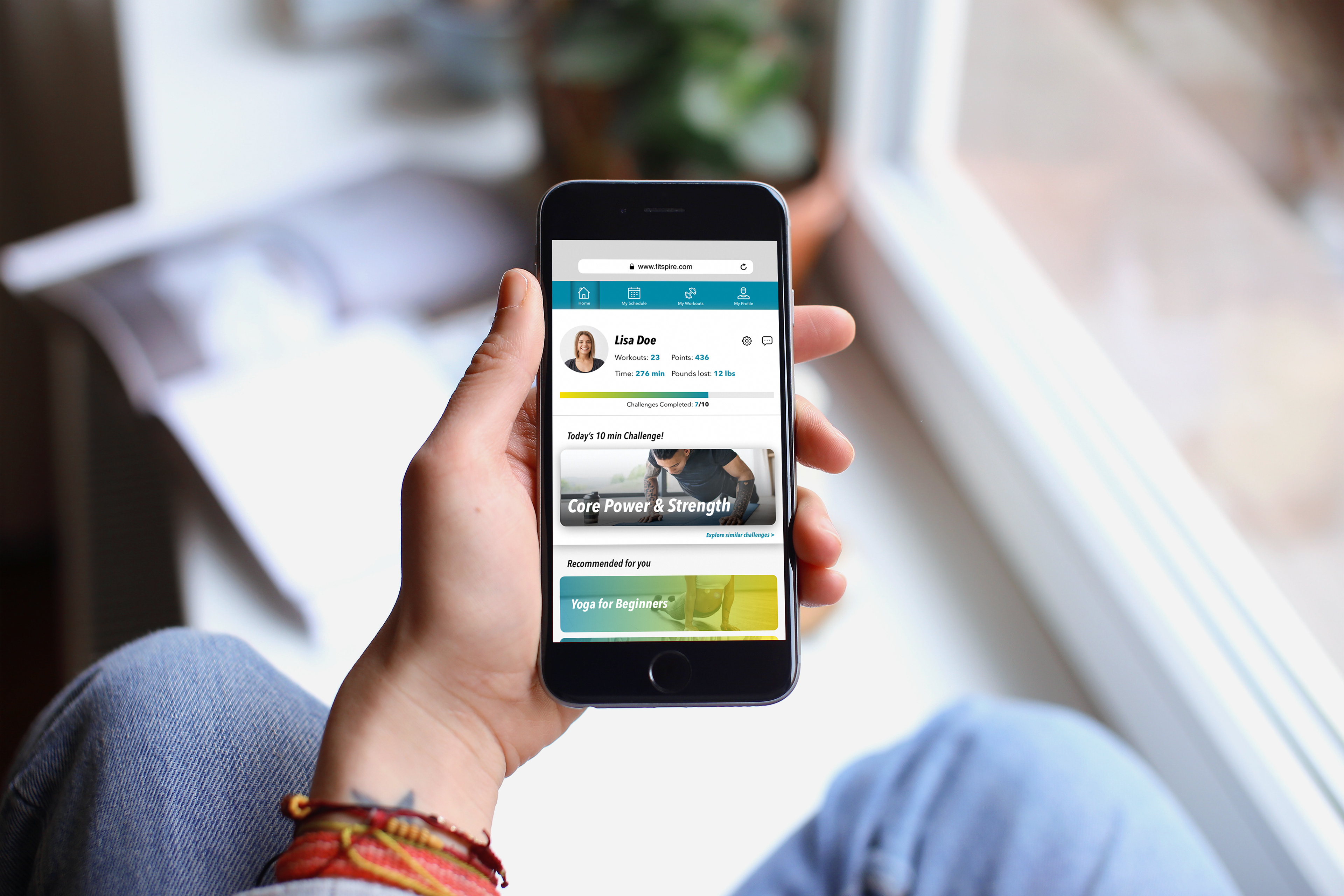
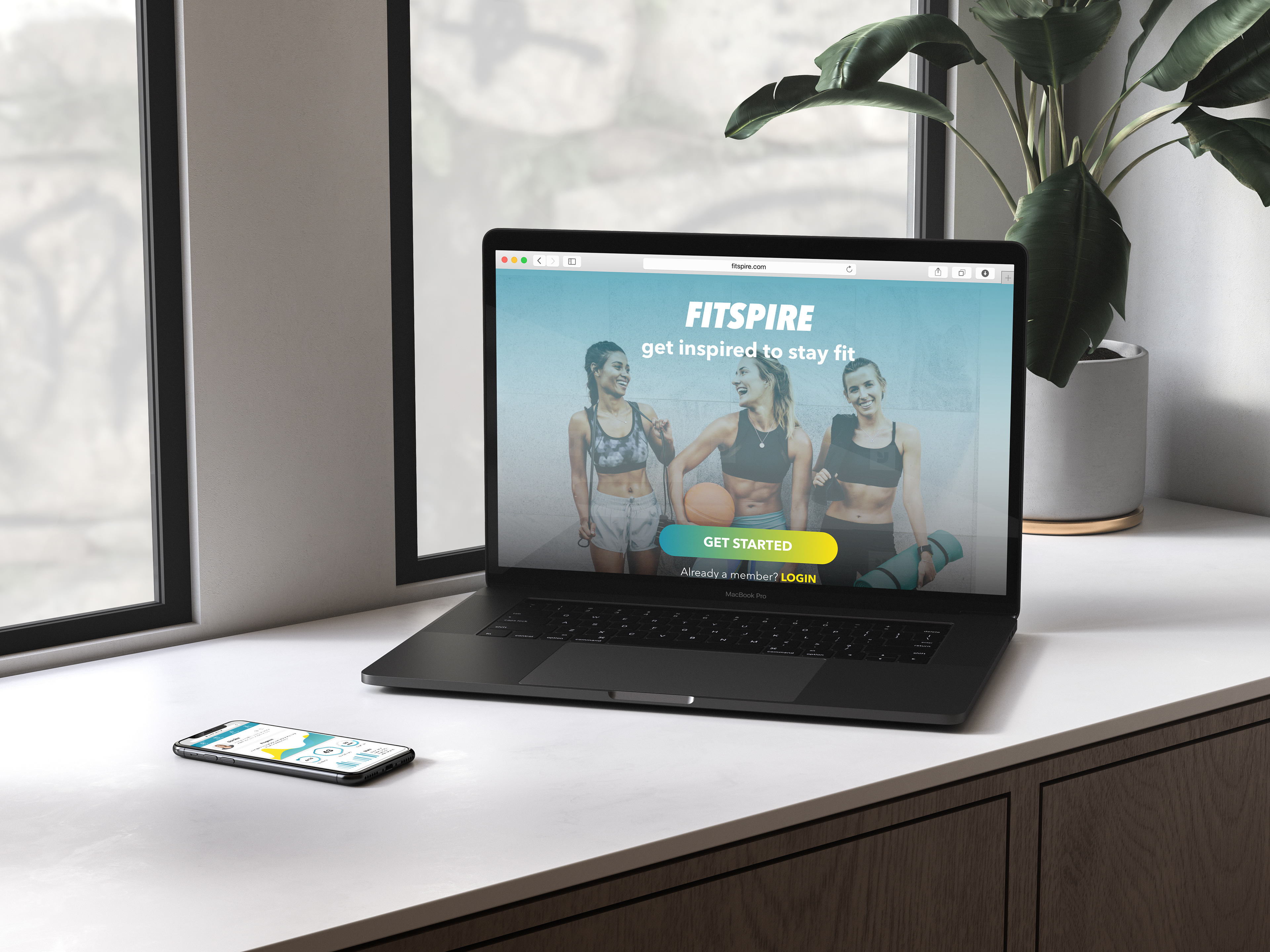
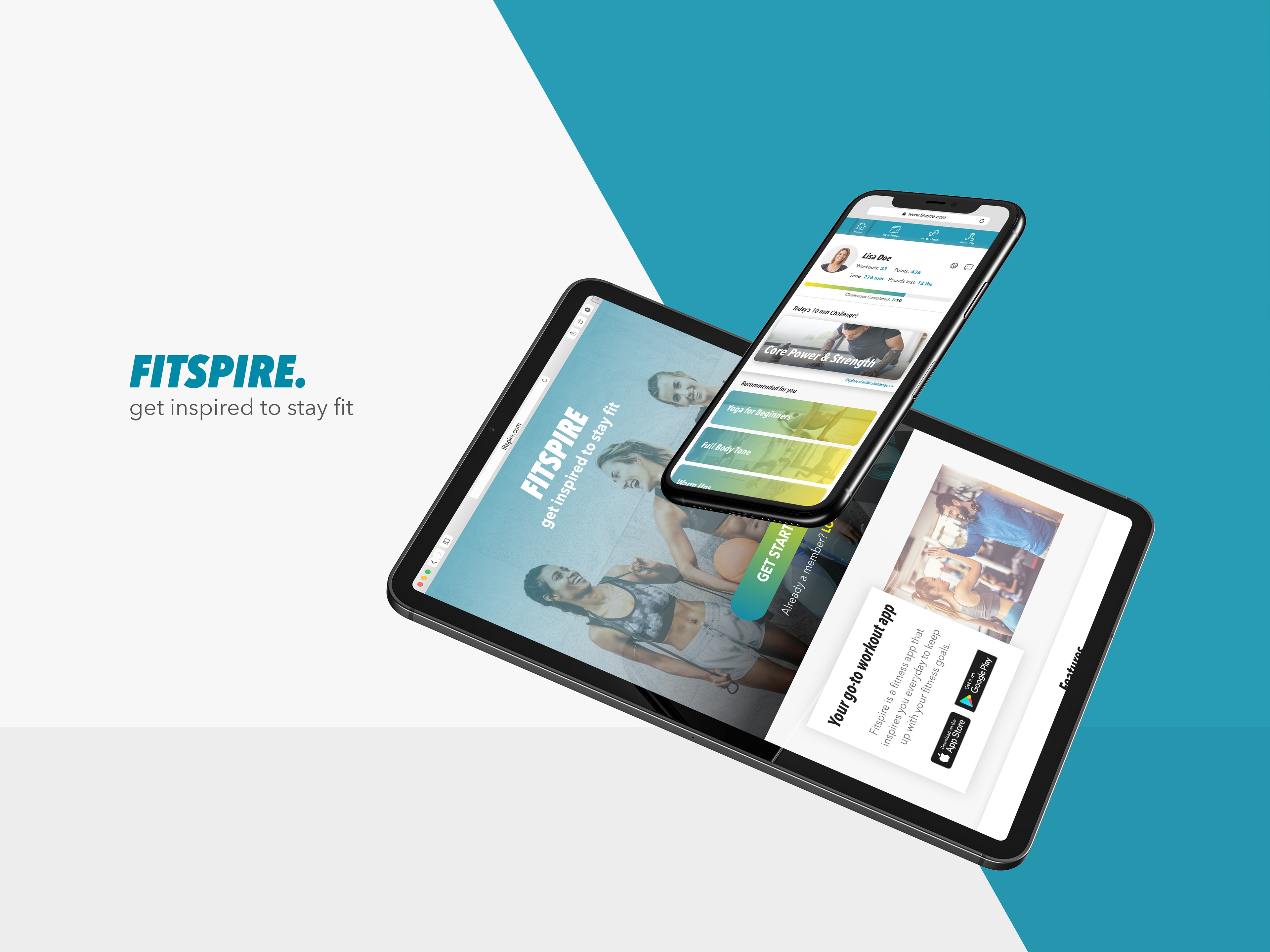
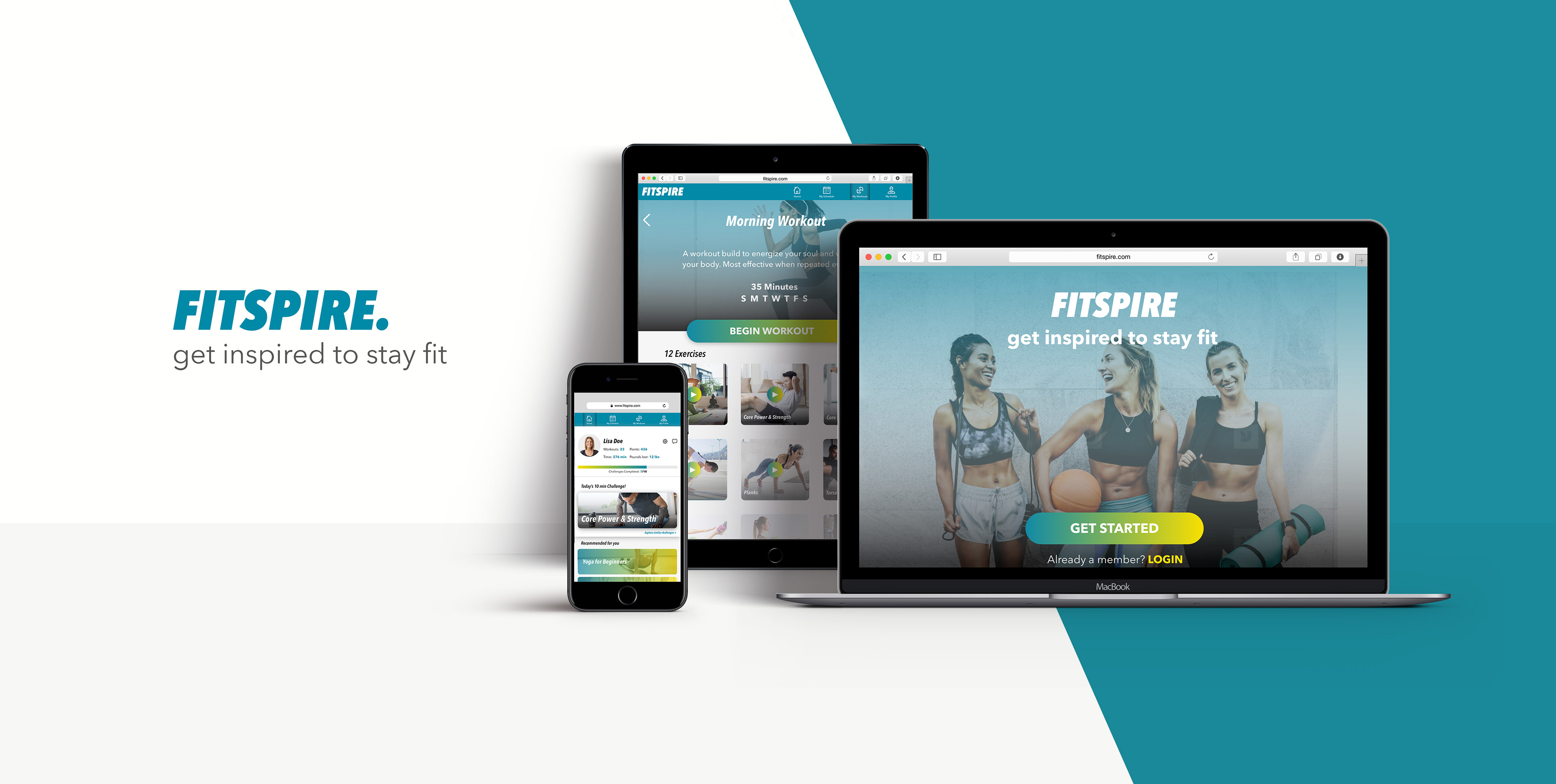
Fitspire is a completely customizable fitness web app that is simple to use, yet, highly useful for distracted fitness enthusiasts looking to reach their fitness goals. With features designed to inspire, motivate and help users stay on track, Fitspire helps users to get and stay in shape.
Who is it for?
This app is for users who want to workout and have a routine but find it hard to incorporate daily workouts, due to lack of time to hit the gym; because they feel bored doing the same workouts and as a result lack motivation; they are too busy and fitness comes last on their list.
My role
UI/UX Designer(UX:20%, UI:80%)
I was provided with UX research for this project that comprised of and I worked on Information Architecture, wireframes, Interaction Design and the entire UI.
Challenge & Approach
A lot of people are interested in working out and even enroll in gyms, try to form a fitness routine, try working out with friends but find it difficult to stay consistent due to the fast-paced lives and busy schedules. Many fitness enthusiasts constantly try different fitness apps for exercises or tracking workout progress but are still looking for an app that successfully motivates a person to build better habits while providing with simple, functional features. Most apps are over loaded with information and too many features that aren't but out to a individual needs.
UX research for this project was provided that included the 5Ws, persona, design criteria and partial design guidelines. I started by running a competitive research by downloading and going through some of the most popular fitness web apps. Once I gained enough perspective I started brainstorming on a user-flow diagram.
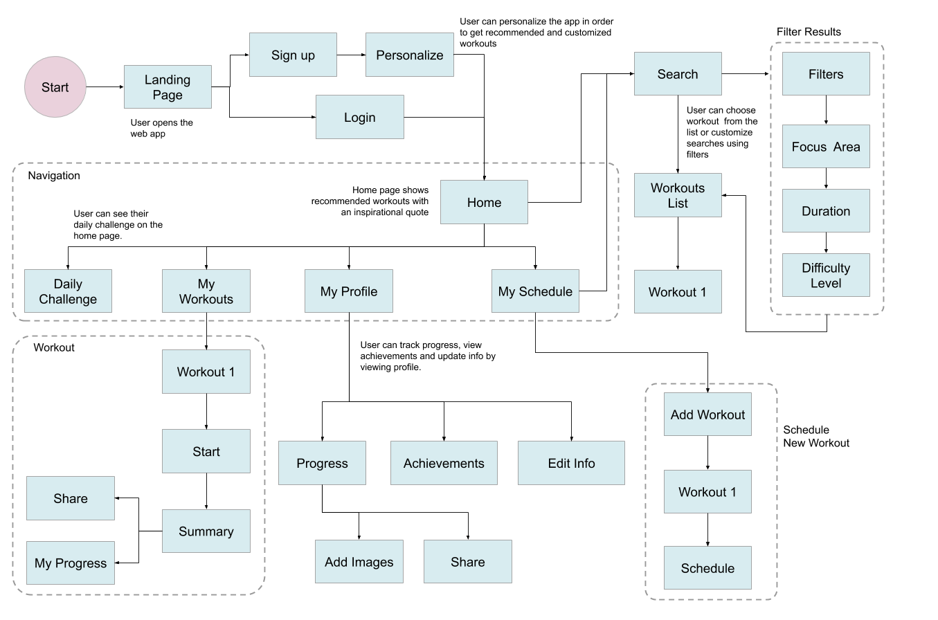
User Flow Diagram
The user stories, feature requirements and goals of our provided persona was analyzed and taken into account to design a user-flow diagram that would guide the app design and help stay on track throughout the process.
Wireframes
Low-fidelity wireframes were created using rapid prototyping process based on user-flow diagrams. The focus was to logically figure out the main composition and placement of major components in each screen.
Mid-fidelity wireframes were a result of a number of iterations designing with grids & layouts, content hierarchy and spacing. This helped give structure to each screen, making them consistent resulting in a more holistic design throughout the app screens.
Mood Board
Two mood board options were created capturing the 'essence' of the personality of the fitness app. This helped streamline the visual quality, the kind of mood the photos would set and the color palette that would best help express the app aesthetically.
MOOD BOARD 1: Represents (orange red)aggression, power, fierceness coupled with (black) seriousness and intensity.
MOOD BOARD 2: Gives out a (Yellow)fun vibe bursting with energy yet reflects a sense of (blue) routine and discipline that the users desire.
The goal of this app is to cater to a wide variety of users, especially, users who are getting into fitness and those who want to be disciplined while having fun sessions, like our persona (Rebecca).
Considering this, I went with MOOD BOARD 2.
Style Guide
Design Language
Style guide was based off of the selected mood board. Keeping the color palette and the type of images, additional elements such as UI elements, illustrations, typography and iconography were created and applied to the screens appropriately.
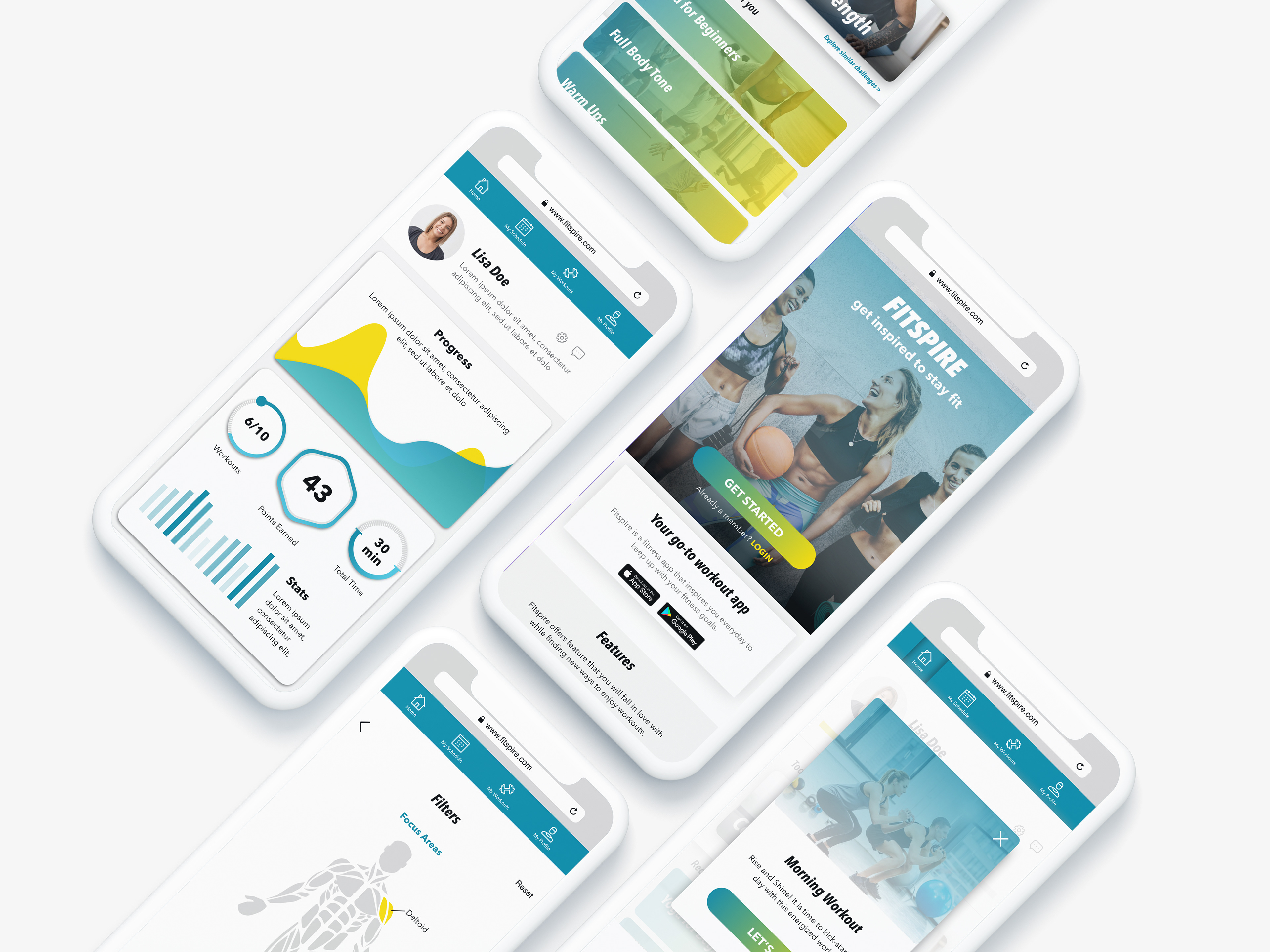
High Fidelity Wireframes
High-fidelity wireframes had very few changes from the mid-fidelity wireframes, composition-wise but helped take the aesthetic quality of the app to the next level. These wireframes helped show a lot more detail and gave a better idea of what UI elements look like.
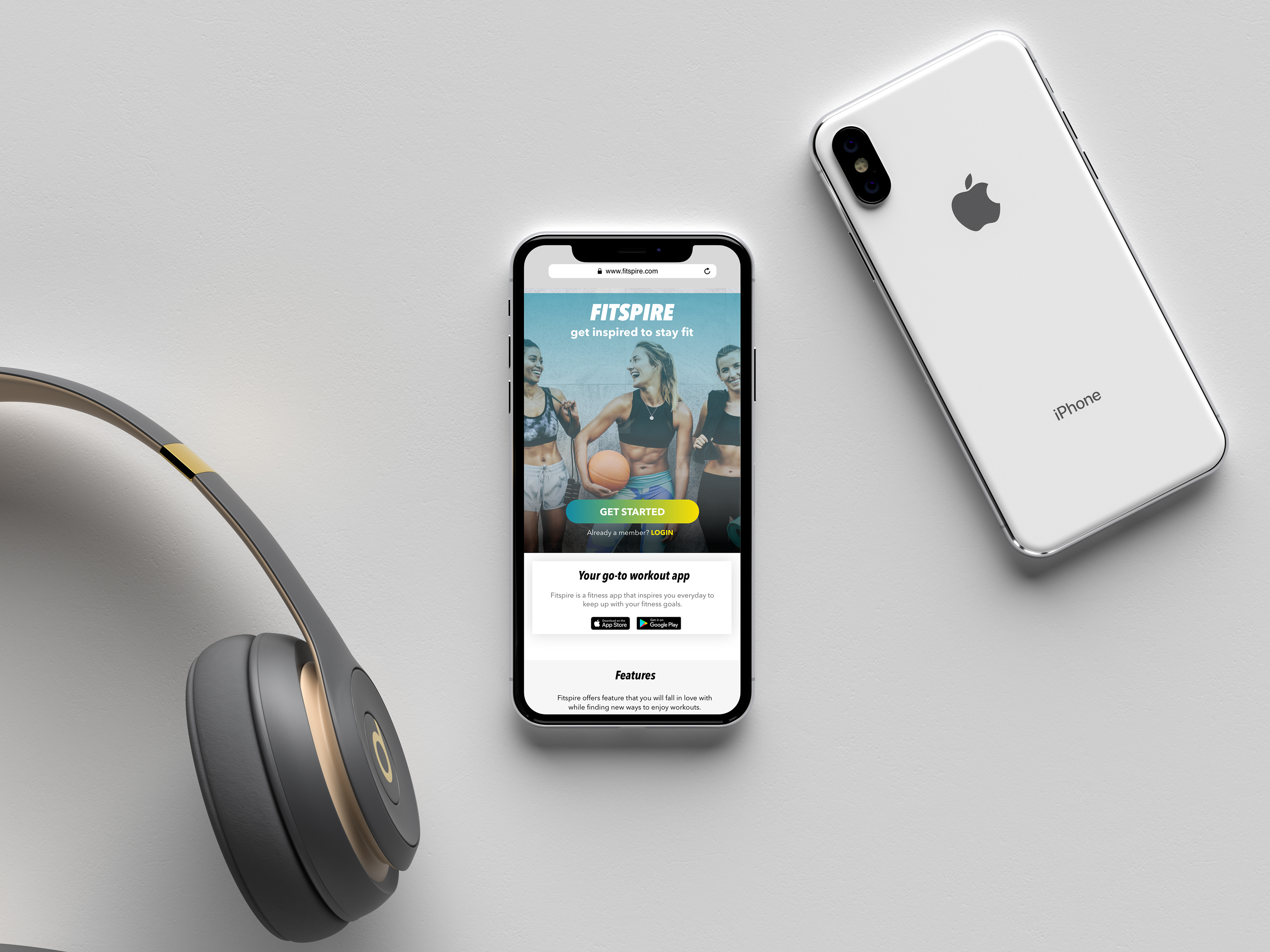
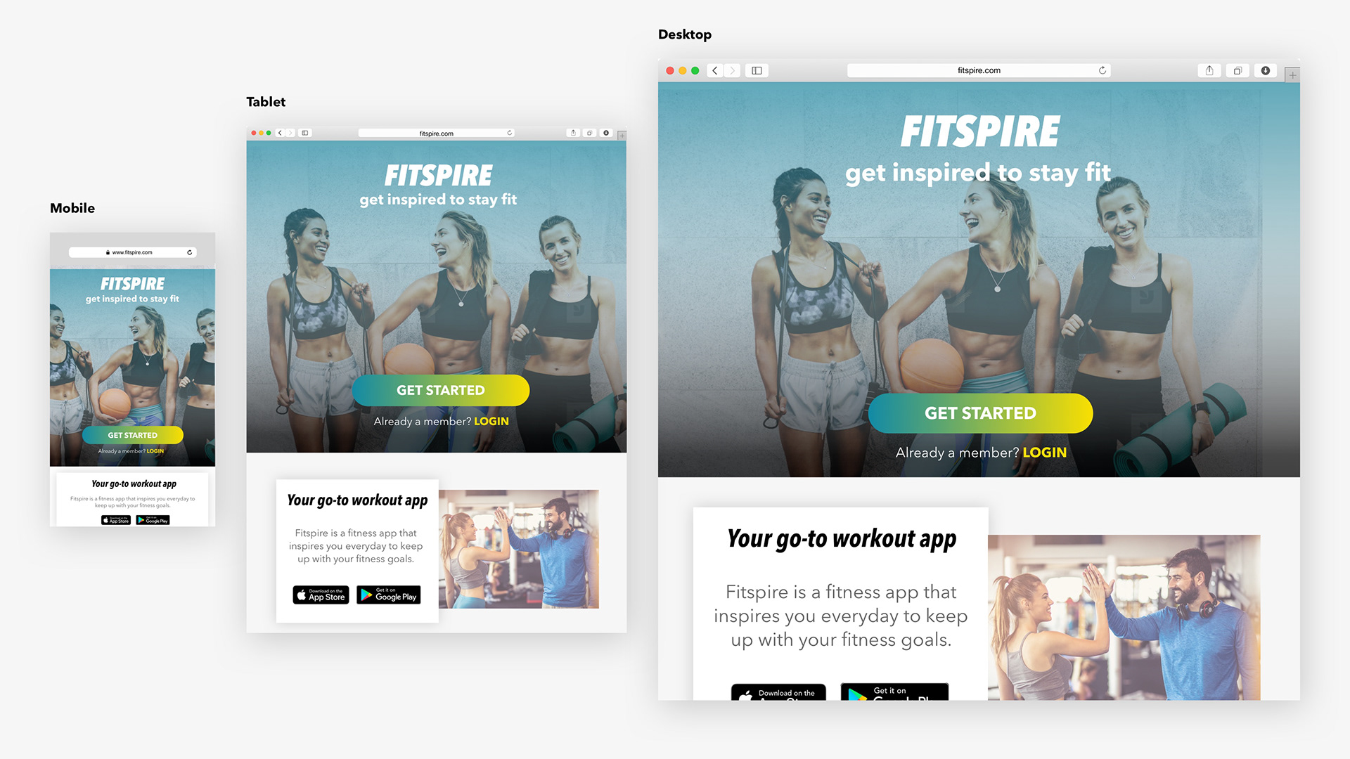
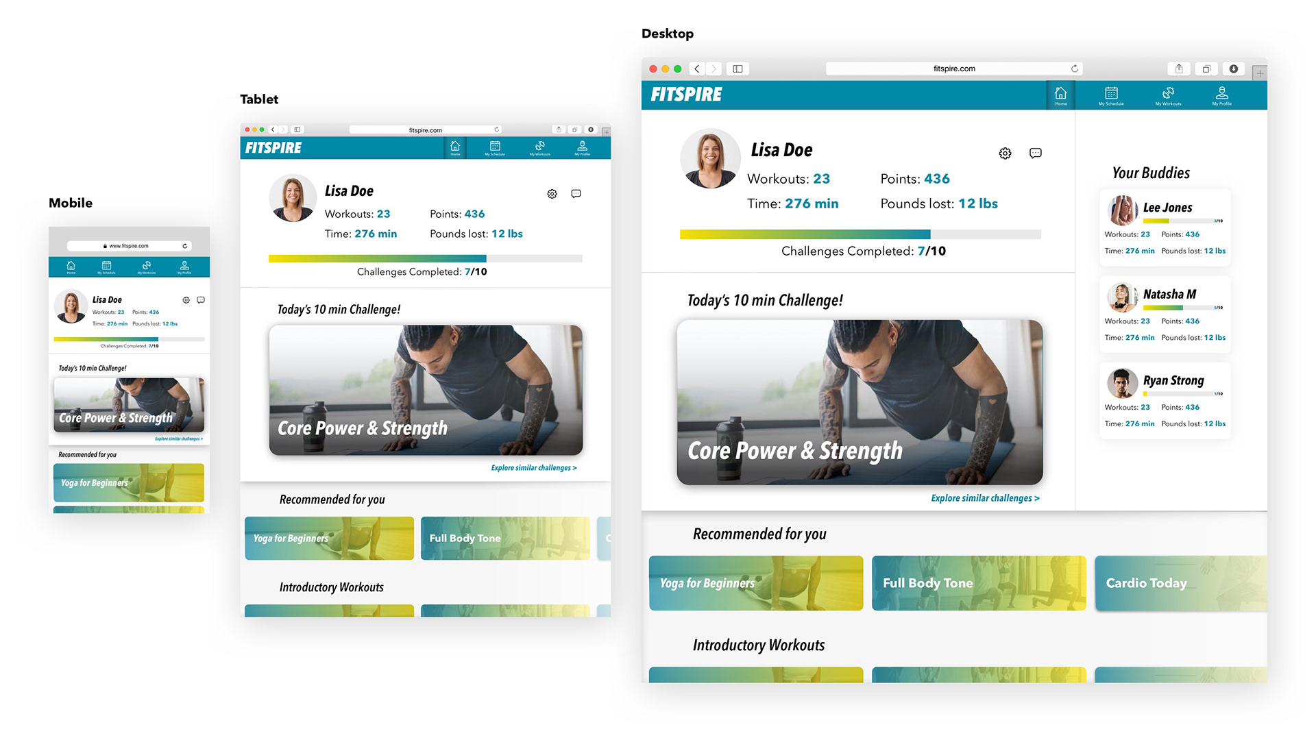
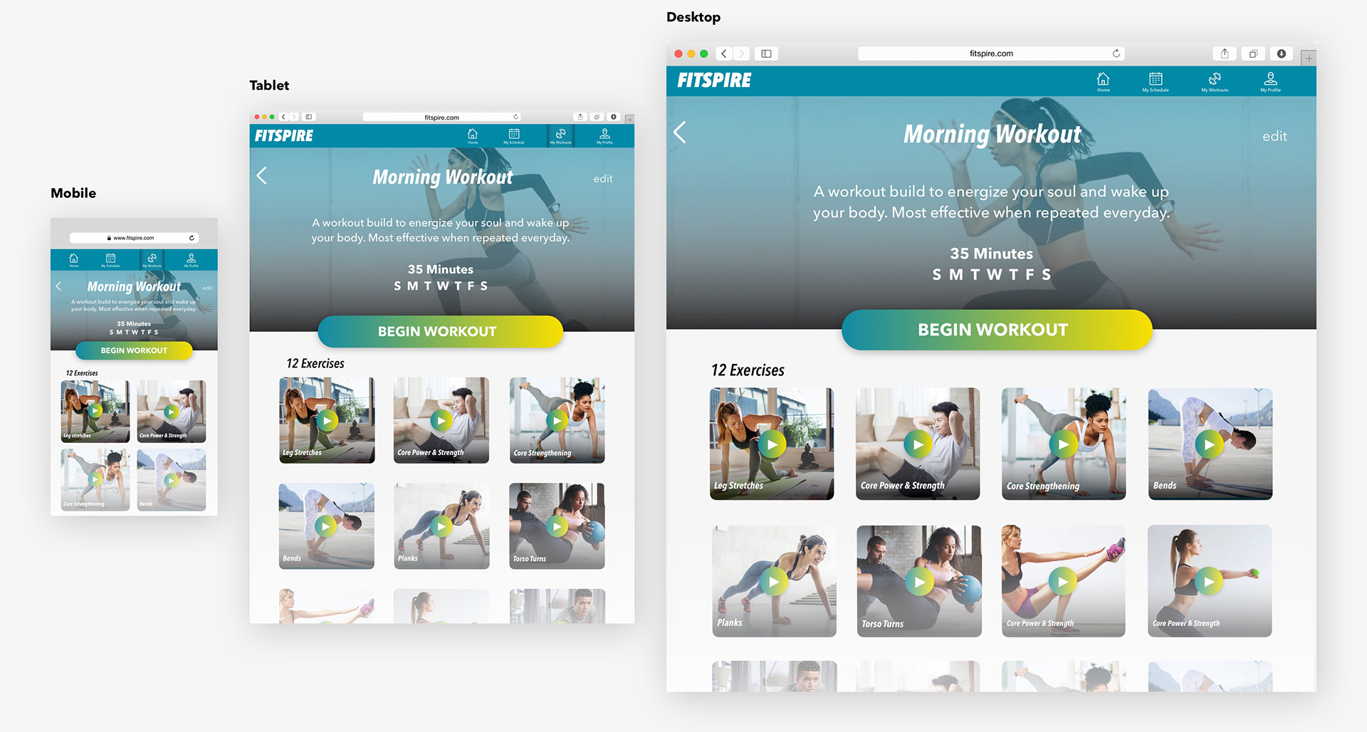
Responsive Design
Three different breakpoints were selected to make the Fitspire app responsive. The three breakpoints are: Mobile,Tablet and Desktop.
The app was first designed for mobile breakpoint as I took the mobile-first approach, and then adapted content for desktop and tablet breakpoints. I decided to design three screens considering how unique the UI elements in those screens were.
Final Mobile Prototype
Working on this project from start to finish over a period of 4 months with a human-centered approach has made me appreciate the process. I have learnt how valuable iterations are while designing to come up with the most functional and beautiful UI, and how important it is to take time figuring out the best fitting typography and refining design details for a pixel perfect design. This approach results in a product that is:
Beautiful . Functional . Relevant . Appealing