Introduction
What is it?
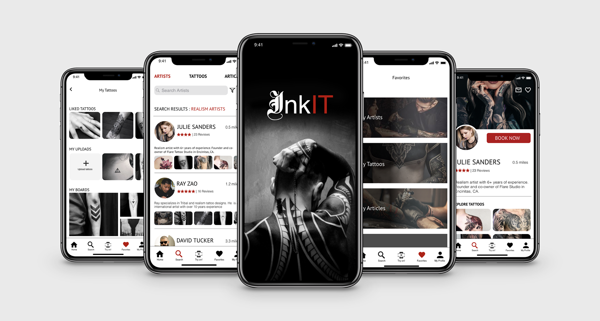
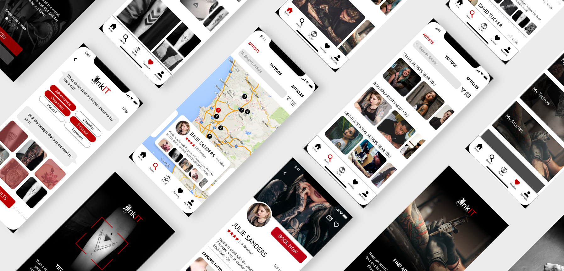
InkIT is a one-stop tattoo app that lets users customize their daily feeds by taking a tattoo personality test, find skilled artists easily around the world and communicate with them directly, choose from a variety of curated tattoo designs and try on virtual tattoos on their bodies using an augmented reality feature that projects selected design onto their skin.
Who is it for?
This app caters to a diverse range of users ranging from tattoo-curious to tattoo enthusiasts. This app is for anyone who is curious about tattoos but is hesitant to get one due to lack of tattoo knowledge and exposure; It is for seasoned tattoo enthusiasts who are looking for a simplified tattoo process, from exploration to execution; It is for users who have suffered tattoo regret in the past and are bent on getting a tattoo that they love this time.
My role
As the lead UX/UI Designer for this project, I was involved in the entire process including the overall strategy, user research, information architecture, user testing, interaction design and visual design.
My Approach
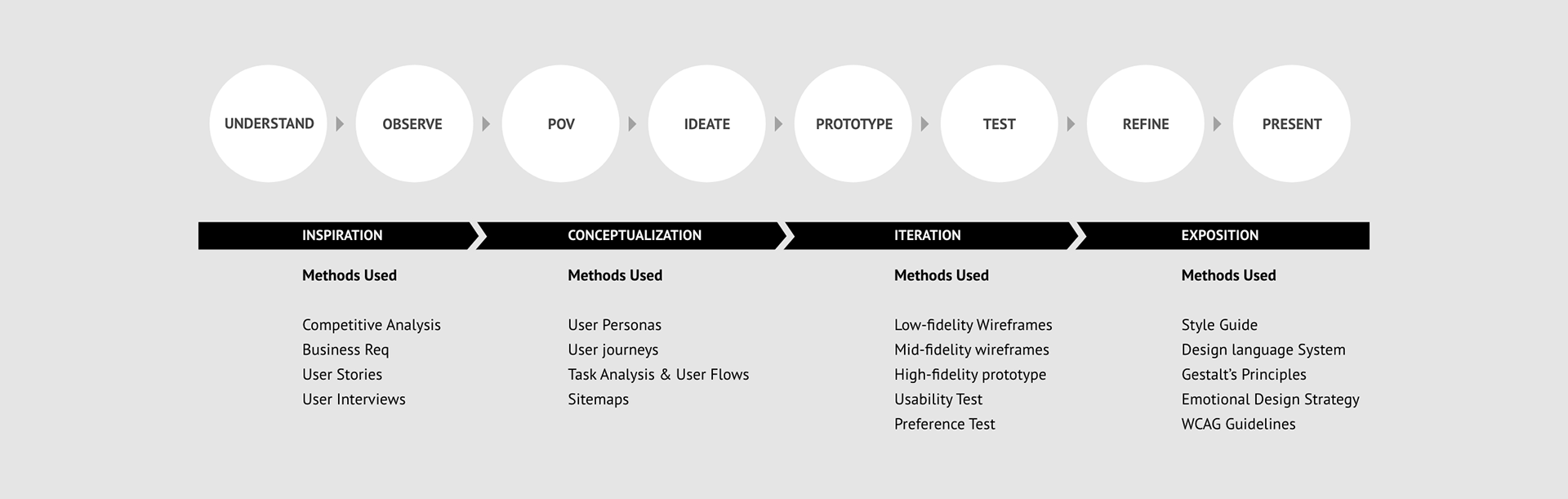
The Challenge
Many tattoo enthusiasts have expressed tattoo regret due to lack of exposure about the process of getting a tattoo and the knowledge about tattoo hygiene; not being able to find tattoo artists who understand tattoo styles and the colors that work on different certain skin tones; difficulties communicating what type of design they have on their mind and being unable to imagine how tattoo designs would look on their bodies.
Observe
User Interviews
I conducted user interviews by reaching out to 4 interviewees comprising of persons who already had a tattoo and who were interested in getting one in the near future.
User Interview Goals
1. Understand users’ goals, needs and motivations with respect to the tattoo process.
2. Understand what tasks and where users would want to accomplish.
3. Explore opportunities or gaps in competitive apps by understanding user frustrations, triggers and preferences.
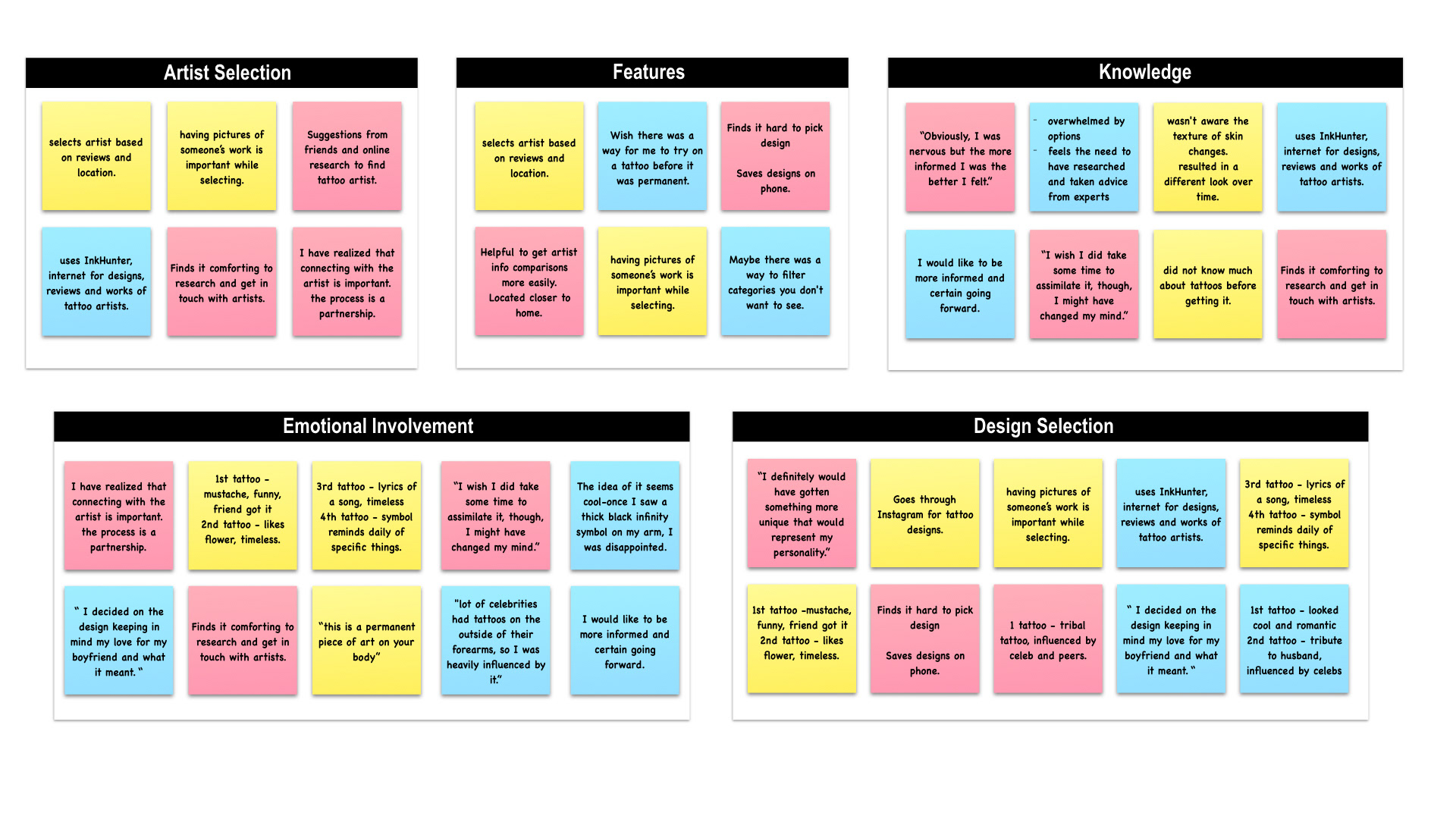
Affinity Mapping after collecting research data.
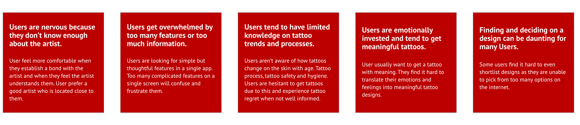
Key Findings from User interviews

Point of View
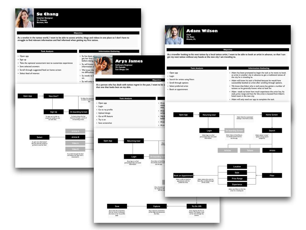
User personas
Creating user personas and defining their personalities, behaviors, goals, and needs from the data I collected helped me stay focused on users' need throughout the process. Considering user persona profiles I created user journeys for each persona to help me see their goals and needs clearly.
Ideate
Task Analysis & User Flows
Defining User Journeys was a crucial step towards deriving user flows and task analysis for each persona keeping in mind their behaviors and goals. I was able to better define each step a persona would take to accomplish a task by working through user flows and task analysis.
Information Architecture: Sitemap
The user flows and task analysis of each persona was analyzed and taken into account to design a sitemap. Participants were recruited for the card sort and the insights were responsible for a refined sitemap with reorganized sub-categories categories.
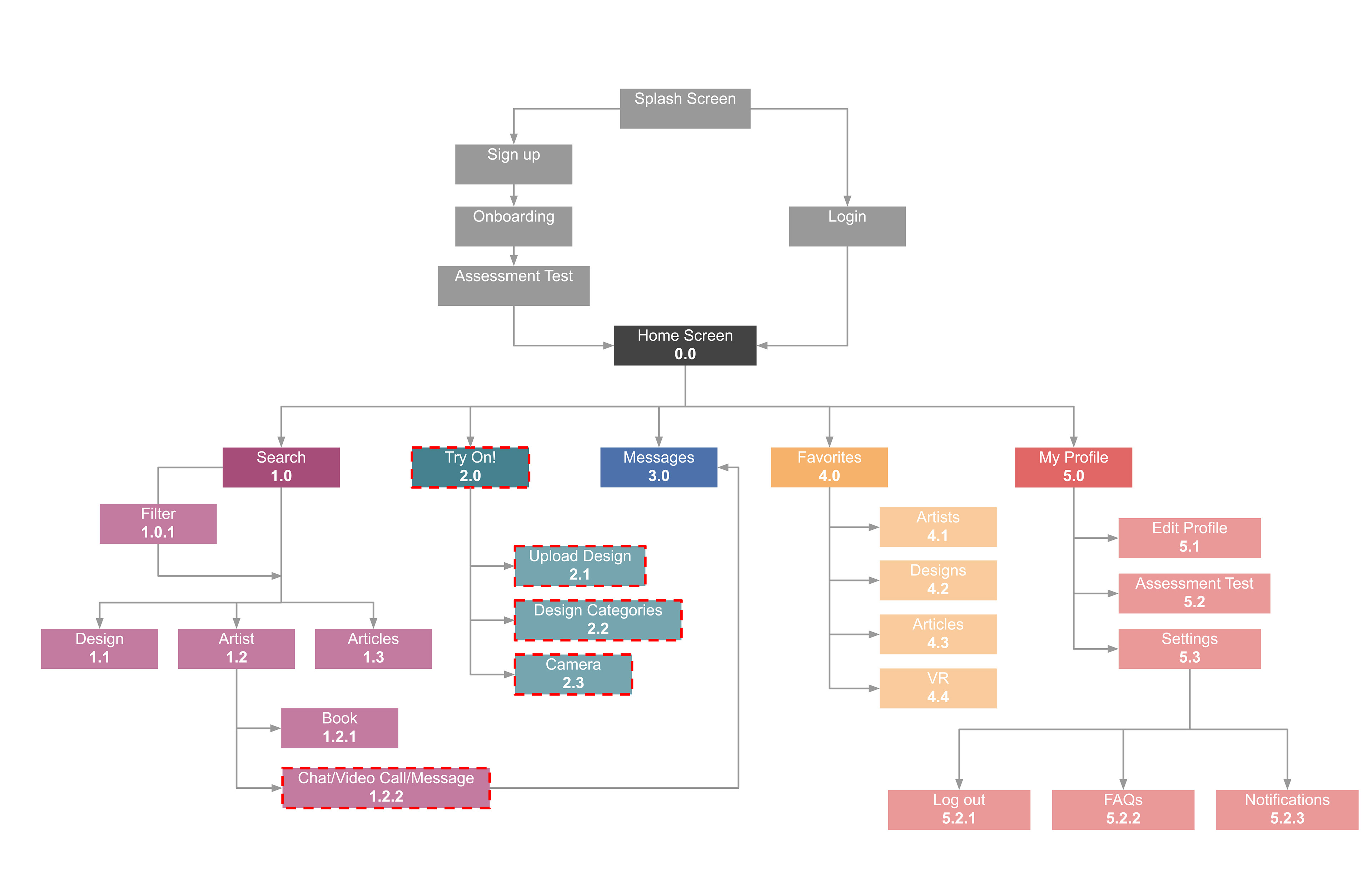
Information Architecture: Revised sitemap with revisions shown in red dashed lines
Prototype
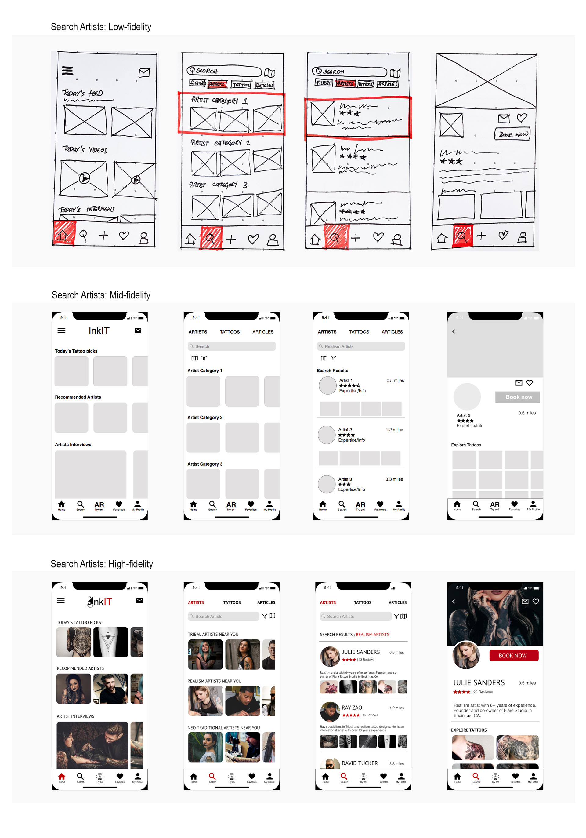
Wireframes & Prototype
Low-fidelity wireframes were created using rapid prototyping process. The wireframes went through a number of iterations to evolve into a high-fidelity prototype.
This clickable prototype allowed users to perform the following tasks during testing:
1. sign-up to the app,
2. Take assessment test
3. Search and book artists
4. Take a look at saved tattoos
TEST
Usability Testing
The usability test plan and script were created prior to conducting usability tests. After testing 6 participants, the data collected during the tests was sorted using affinity mapping and rainbow spreadsheet, which proved to be powerful tools to organize the information I gathered during the usability test session, and helped me recognize the most crucial errors.
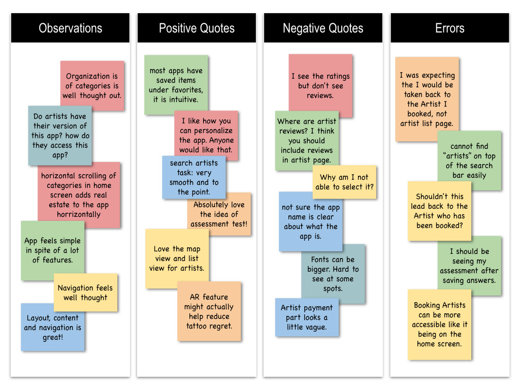
Affinity mapping used to analyze the data collected during test.

Rainbow spreadsheet used to group content and analyze possible solutions.
Redefining Design
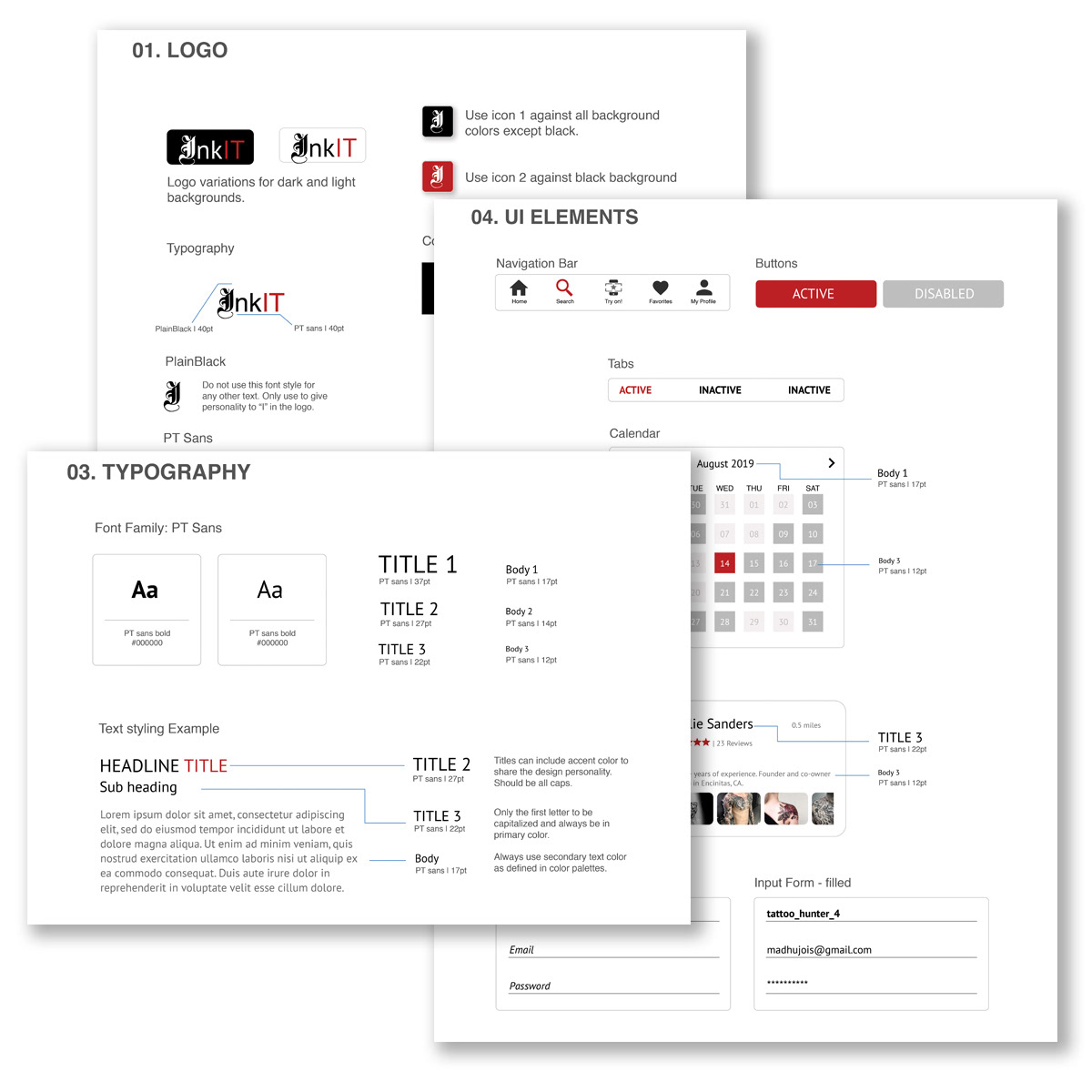
Design Language
After the testing and refinement of features in the app, a design language was established for to refine the design of the interface, maintain consistency and bring together the personality of the InkIT.
Once the design language was applied to the interface, I followed a set of strategies to further refine the design of InkIT, which are:
1. Gestalt's principles
2. Emotional Design Strategy
3. Designing for Native Platforms - ios
4. Accessibility using WCAG guidelines
Present
Final Design
Working on this project from start to finish over a period of 4 months with a human-centered approach has made me appreciate the process. I have learnt how valuable constant feedback is while designing, and how important testing is for the evolution of the product. This approach results in a product that is:
Valuable . Engaging . Simple . Useful
